UniqueUrn
The Color Of Identity: How Art Honors The Authentic Self In Eternal Remembrance
Jun
The permanent departure of a cherished family member brings a profound emotional crisis to our household. Within the complex landscape of grief psychology, individuals navigating unique LGBTQ+ life paths often face a silent challenge called “Disenfranchised Grief.” This deep heartbreak intensifies when traditional societal structures overlook or oversimplify the authentic essence of their personal journey. Fortunately, modern memorial design actively evolves to provide absolute psychological safety and total emotional validation for every individual. We firmly believe that every single life story genuinely deserves a prestigious, highly customized masterpiece for celebration. Therefore, this special feature explores how the brilliant strategic semantics of color beautifully transform mourning into eternal family pride. Let us embark on an elegant exploration of visual symbolism designed to guard your legacy forever.
A Semiotic Discussion: Industrial Evolution and the Fluidity of the Rainbow Symbol
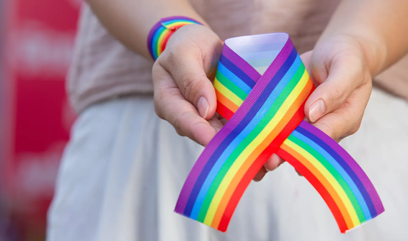
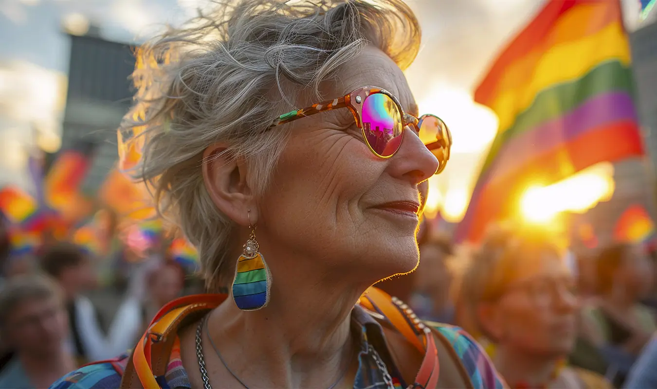
The rainbow operates globally as the ultimate visual shorthand for authentic self-expression and diverse human dignity. In 1978, American artist and civil rights activist Gilbert Baker intentionally designed the very first Pride flag. He gathered direct inspiration from universal natural elements to engineer a brilliant beacon of infinite hope and safety. However, the structural morphology of this historic banner underwent major industrial adjustments over recent decades. The original configuration proudly held eight distinct colored stripes instead of the modern six-band version. Industrial textile limitations and commercial printing demands eventually forced developers to reduce the palette for mass production.
The Symbolic Semantics of the Original 1978 Pride Palette
|
Color Position |
Original Hue (1978) |
Realist and Spiritual Meaning |
Industrial Production Status |
|
1 |
Hot Pink |
Sexuality and Sensuality |
Removed due to severe fabric dye manufacturing scarcity. |
|
2 |
Red |
Life and Survival |
Retained at the absolute top to signal vital energy. |
|
3 |
Orange |
Healing and Recovery |
Retained to mirror the gentle process of mental restoration. |
|
4 |
Yellow |
Sunlight and Visibility |
Retained to represent a bright presence within global societies. |
|
5 |
Green |
Nature and Truth |
Retained to confirm that identity is an organic truth. |
|
6 |
Turquoise |
Art and Magic |
Removed because symmetrical striping was difficult to produce commercially. |
|
7 |
Indigo / Royal Blue |
Harmony and Serenity |
Modernized into a deep blue tone for sharper visual perception. |
|
8 |
Violet |
Spirit and Fortitude |
Retained at the base to celebrate the resilient human spirit. |
Interestingly, this Western spectrum shares deep, harmonious intersections with ancient Eastern spiritual wisdom. Within traditional Buddhist philosophy, radiant rainbow light streams directly through the “Prabashvara,“ representing the six-colored aura of enlightenment. Furthermore, Tibetan Dzogchen teachings describe the supreme attainment of the “Rainbow Body,” where physical form dissolves into pure light. Auspicious auspiciousness also manifests through the “Five-Colored Rainbow Clouds,” signaling the sacred presence of highly compassionate Bodhisattvas. These beautiful semiotic threads prove that a colored spectrum beautifully acts as a bridge toward ultimate personal liberation.
The Global Language of Color: Restoring Neural Balance Through Psychological Safety
A curated color spectrum serves as a visual anchor that soothes our broken hearts after a loss. Formal behavioral research from the American Psychological Association (APA) confirms that color directly impacts human neural processing. Our master design process employs deliberate color blending to create a sense of psychological safety within elegant estates. For instance, rich warm tones effectively restore vital life energy within our private sanctuary. Conversely, cool tones gently stabilize acute mourning periods, erasing extreme stress and cognitive anxiety seamlessly. This strict visual balance works silently in our home, cushioning the human spirit each day.
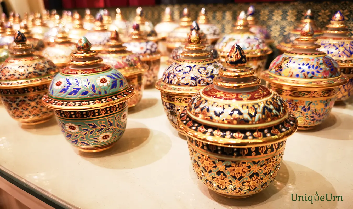
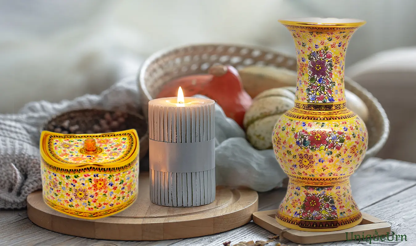
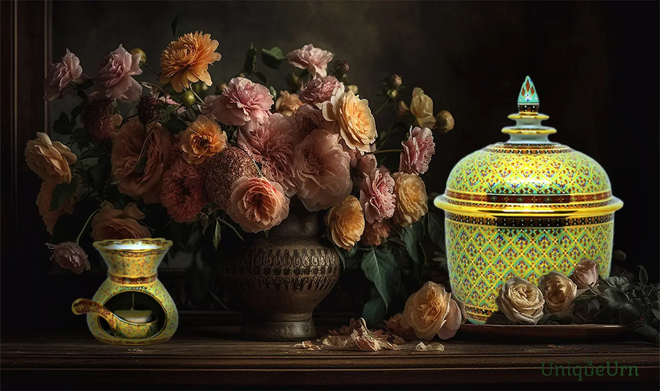
The Splendor of Thaitone: Blending Traditional Palette with Contemporary Aesthetics
We deeply understand, honor, and embrace the magnificent diversity of color shades, holding excellent semiotic meanings. These sublime aesthetics beautifully act as a prestigious representation to reflect the unique taste of an individual. UniqueUrn masterfully crafts premium Thai handmade art through the application of vibrant, diverse traditional color palettes. Our elite artisans pretest color combinations, then carefully paint these intense color groups directly onto heavily detailed, perfectly symmetrical pattern structures. Crucially, we utilize a prominent core color to act as a highly appropriate representation for each unique soul.
This strategic fusion successfully transforms a traditional container into a world-class, highly distinguished sculptural installation. Furthermore, a minimalist modern backdrop allows viewers to focus completely on the exquisite details of Thai artistry. Every hand-drawn line of traditional Bencharong patterns intertwined with pure gold detailing glistens with supreme artistic allure. This perfect, thoughtful contrast beautifully proves that refined taste and authentic self-expression exist together eternally.
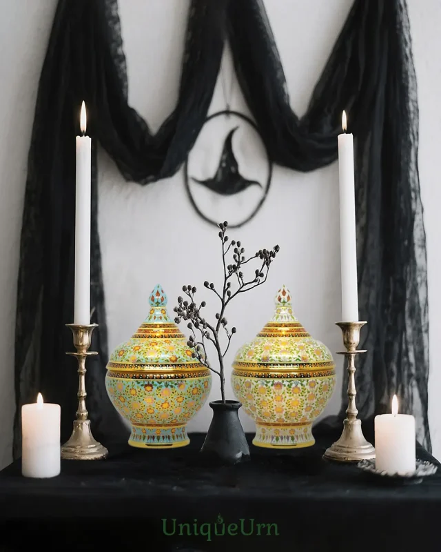
The Right to Be Remembered: Crafting a Prestigious Sanctuary Without Boundaries
We firmly believe that pure love completely transcends biological boundaries and traditional social limitations. Transferring cremains into an exquisite contemporary custom urn beautifully transforms devastating sorrow into permanent family pride. Every single guest will immediately sense an everlasting bond through the timeless language of high art. This prestigious presentation gracefully reduces the traditional social stigma often associated with grieving a unique soul. Our handcrafted masterpieces work silently in your private corner, generating constant positive cosmic energy. This love guards your shared journey safely, keeping their radiant light eternally present within your hearts.
Conclusion: An Enduring Legacy of Love Representing the ‘Authentic Self’
Our master design process carefully fuses exquisite color palettes to constantly reflect pure identity and profound pride. The final departure of a magnificent life never marks a devastatingly sorrowful conclusion to our sacred bond. Instead, it gracefully represents the absolute celebration of a highly exceptional individuality possessing an entirely unparalleled spirit. We passionately dedicate our slow design operations to developing breathtaking sculptural memorial art for every extraordinary journey. Consequently, every single masterwork beautifully preserves a radiant, completely matchless light that remains truly second to none. This prestigious museum-quality Thai heritage securely acts as a permanent, majestic place of honor inside your household.
“We invite you to explore the deep origin of color symbolism through our comprehensive master feature, The Language Of Color In Thai Culture: From Symbolic Meaning To Memorial Art.”